Skip to Content

Motiv Brand Design

Brand development

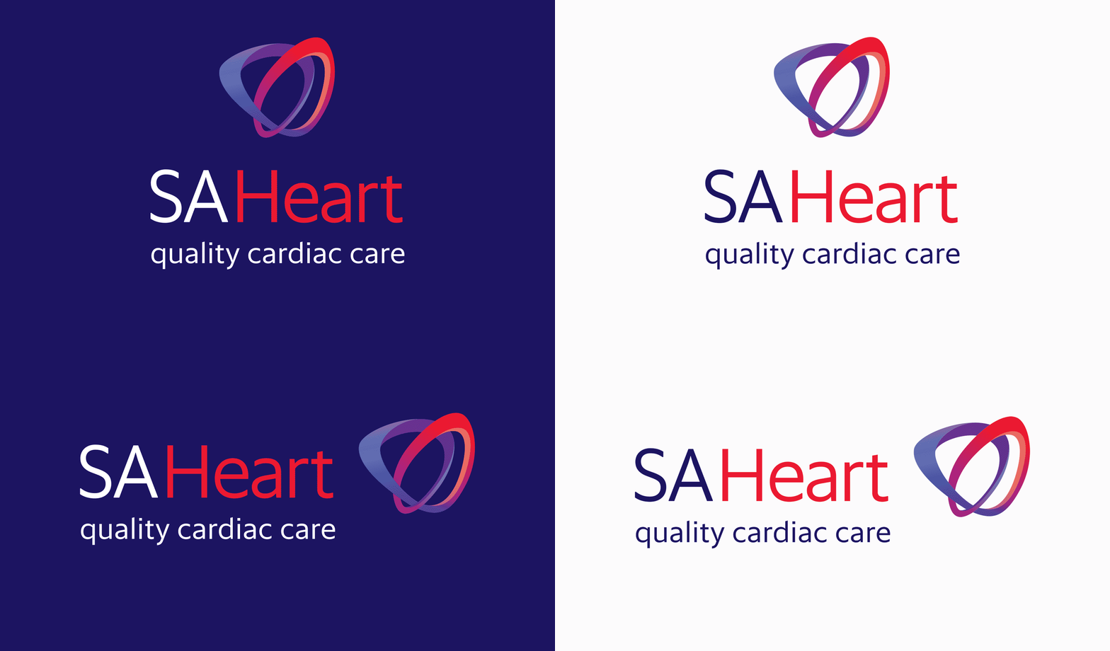
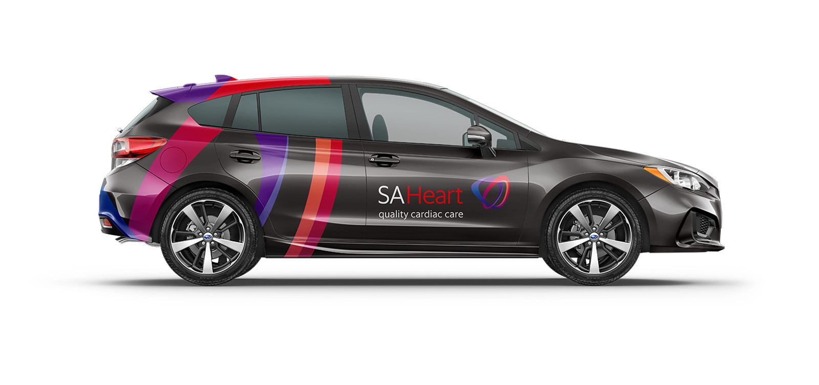
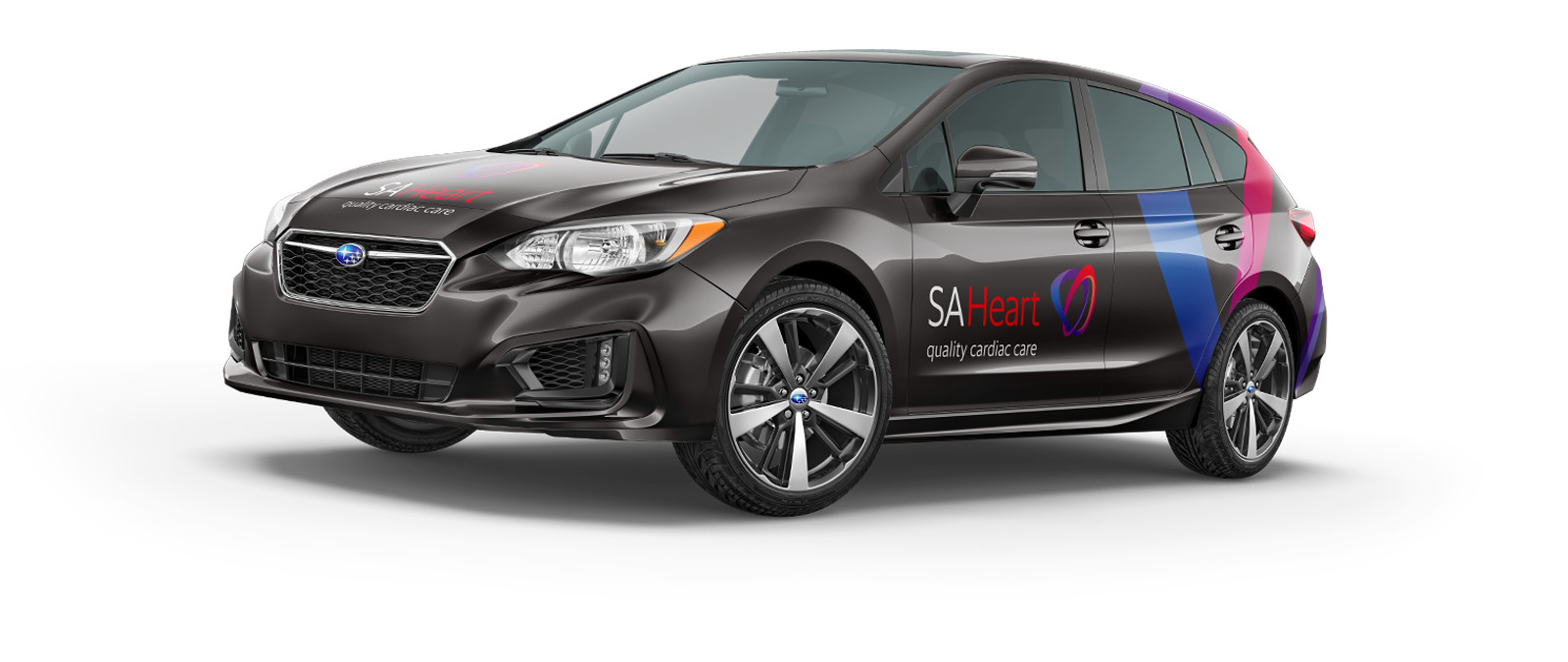
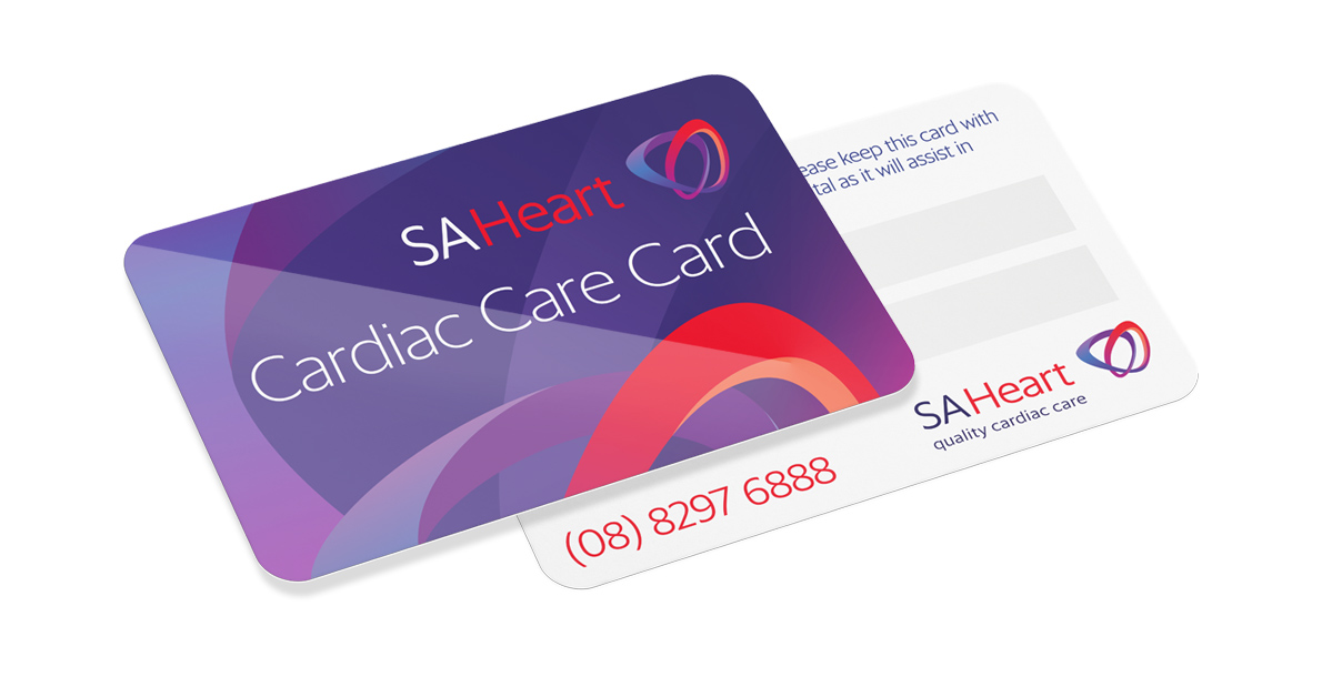
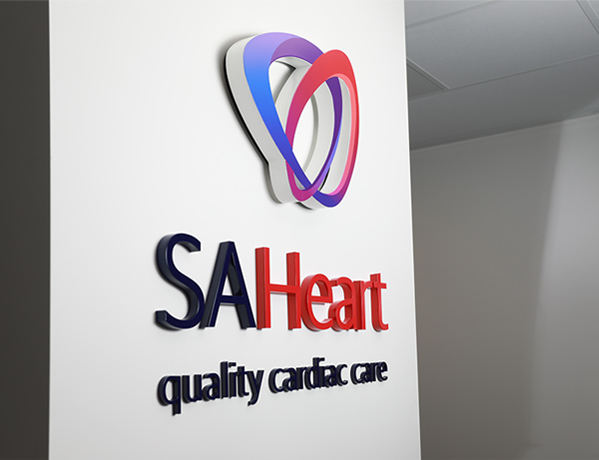
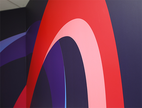
SA Heart approached Motiv in 2017 to redesign its brand identity which had been in place since the company's inception in 1984. The brief was to create a more contemporary identity that would appeal to their cardiologists, referring general practitioners, and most importantly their clientele. The logo needed to be engaging and approachable whilst retaining a visual link to the core of their business – the heart. The result was an illustration of the cardiovascular system with colours ranging from blue to red, left to right representing de-oxygenated and oxygenated blood as it flows through the heart. The symbol also contains an infinity loop representing the continuity of care provided by SA Heart and its practitioners.

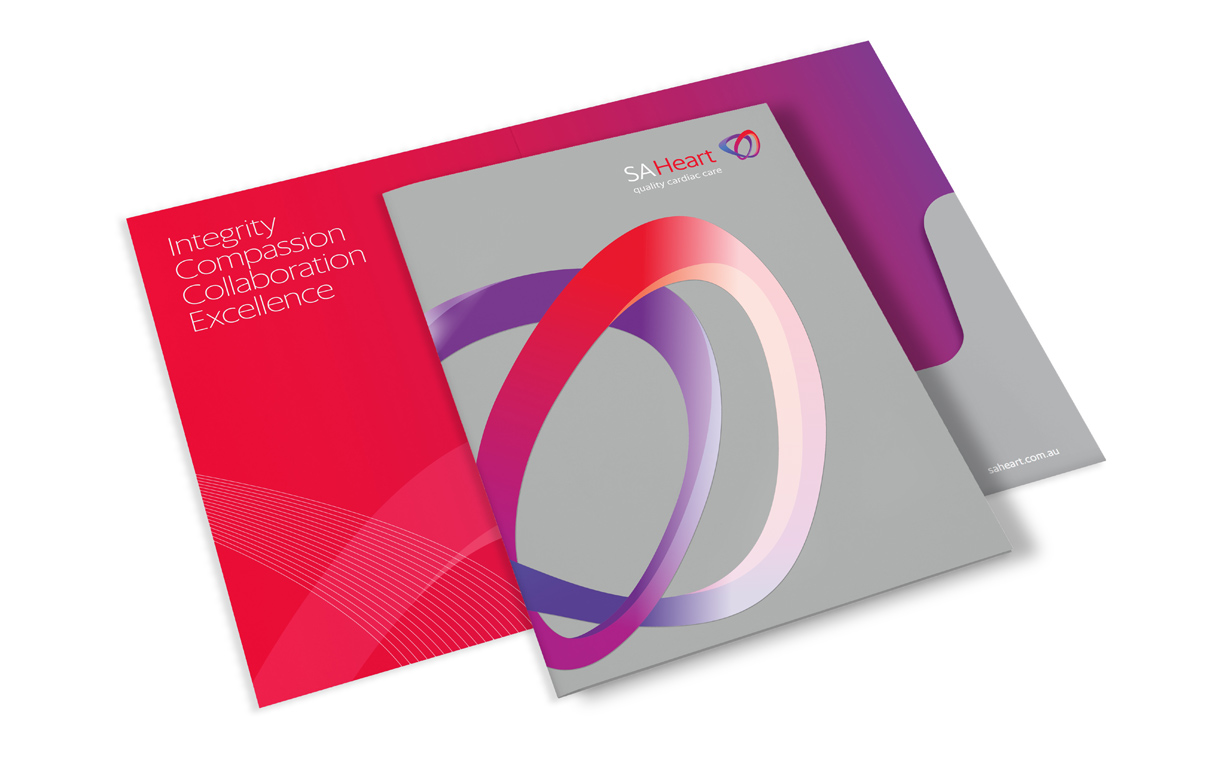
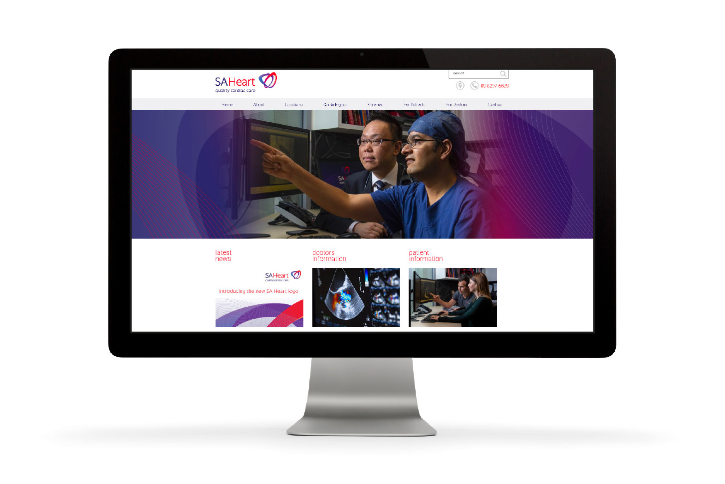
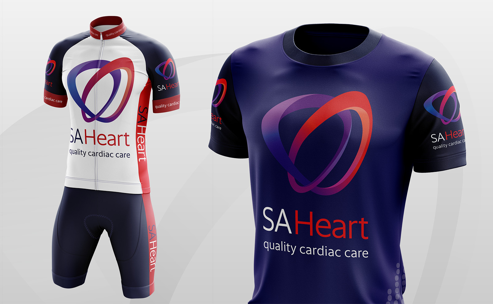
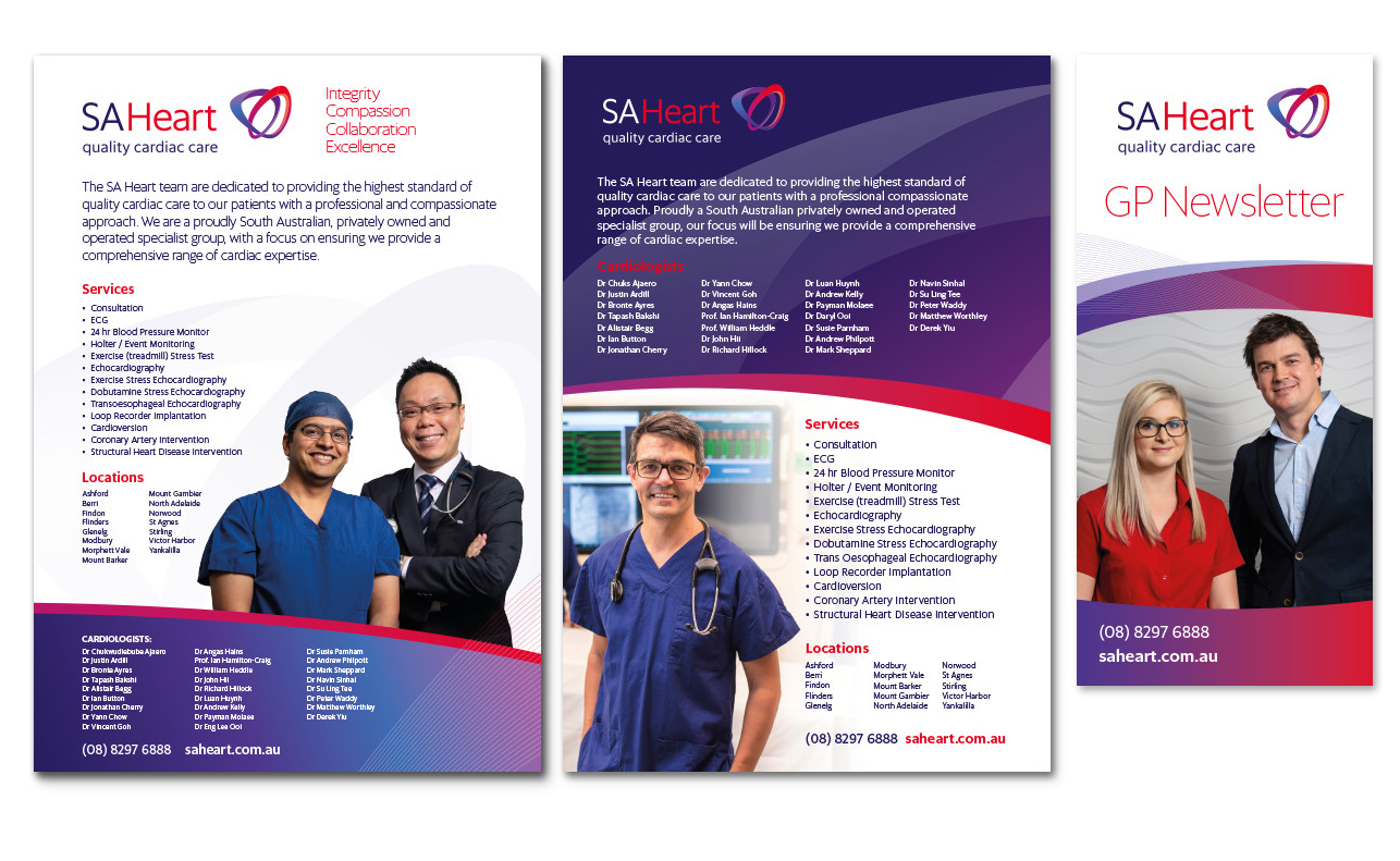
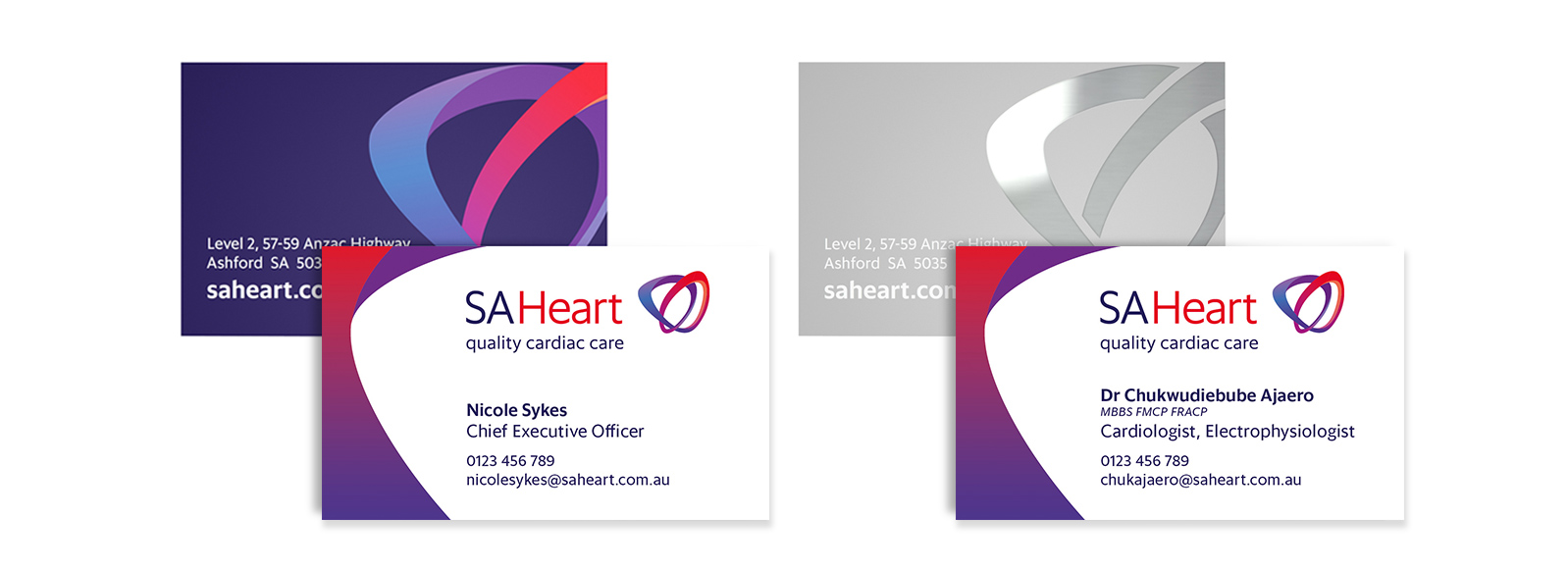
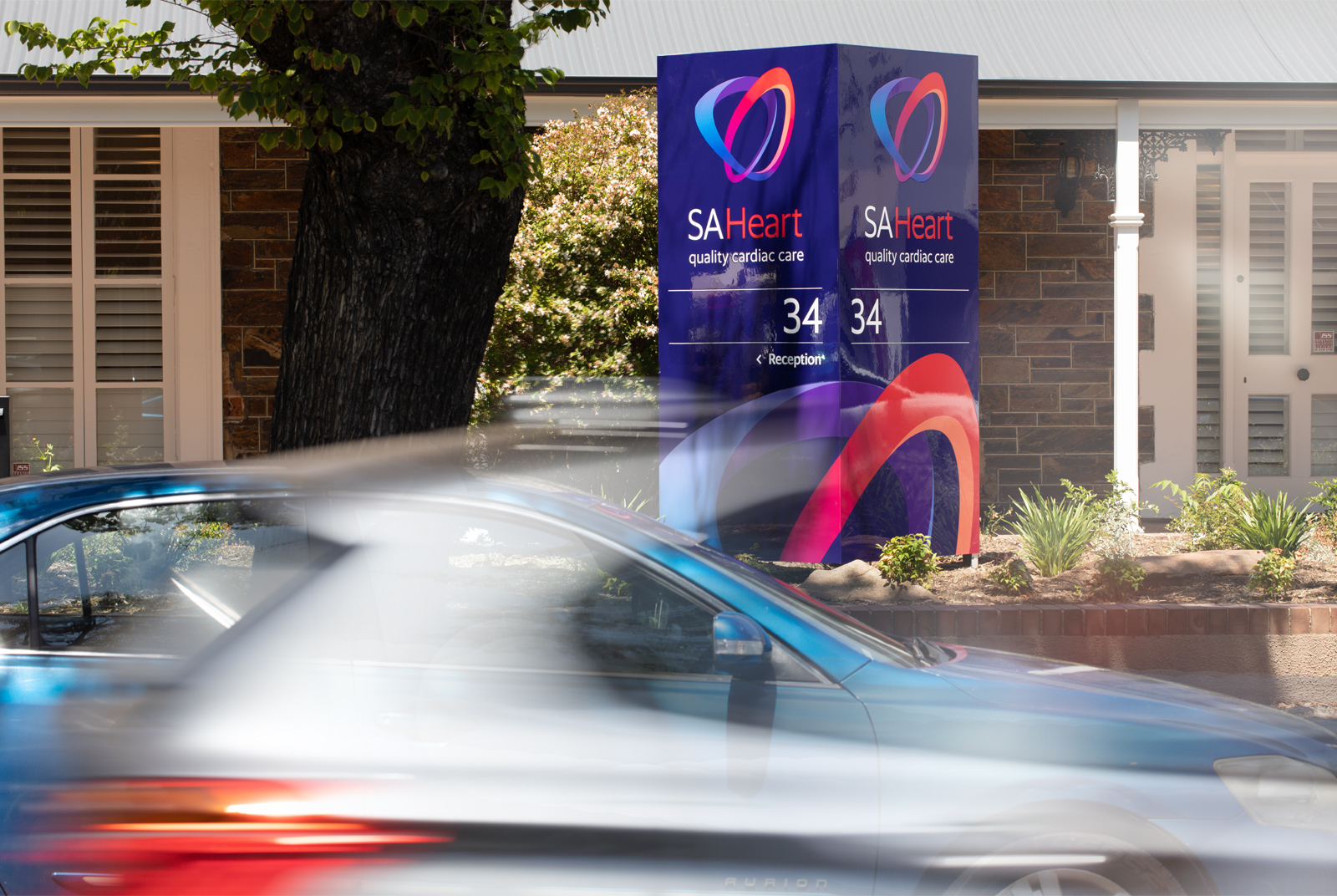
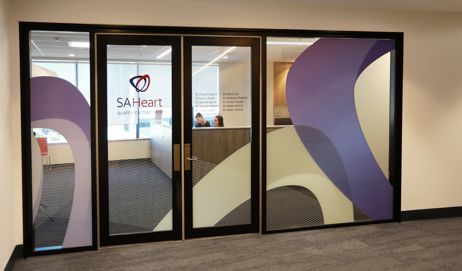
After creating the logo Motiv was invited to participate in a launch event for SA Heart staff where we presented the new design and brand standards to clinical and administrative staff. Motiv created various items of collateral for the event, and after the launch was involved in the brand rollout from stationery and printed collateral through to interior thematics and signage for the company's newly refurbished Ashford headquarters and their recent move into the new Calvary Adelaide.

Get in touch

Find out how we can build or strengthen your brand. We’d love to hear from you so get in touch

Find out how we can build or strengthen your brand: get in touch
Let us build your brand: get in touch